Matplotlib学习
 times read
Contents
概念
figure
在一个图形输出窗口中, 底层就是一个 Figure , 通常称为画布.
Axes
在画布上, 就是图形. 这些图形就是 Axes 实例. 它的 x, y 轴分别可引用Axes.xaxis 和 Axes.yaxis
基础
import matplotlib.pyplot as plt
plot 方法(折线图)
展现变量的趋势变化
plt.plot(x, y, ls="-", lw=2, label="plot figure")
x: 表示 x 轴上的数据y; 表示 y 轴上的数据ls: 表示折线图的线条风格lw: 表示折线图的线条宽度label: 表示图形内容的标签文本. 这个内容要调用plt.legend()方法才会显示
堆积折线图
labels=["l1", "l2", "l3"]
colors=["#8da0cb", "#fc8d62", "#66c2a5"]
plt.stackplot(x, y, y1, y2, labels=labels, colors=colors)
scatter 方法(散点图)
寻找变量之间的关系
plt.scatter(x, y, c="b", label="scatter figure")
x: x 轴上的数据y: y 轴上的数据c: 散点图中的标记的颜色label: 标记图形内容的标签文本
xlim/ylim 方法
设置 X 轴的数值显示范围
plt.xlim(xmin, xmax)
xmin: x 轴上最小值xmax: x 轴上最大值
xlabel/ylabel 方法
设置 x, y 轴的标签文本
grid 方法
设置刻度线的网格线
plt.grid(linestyle=":", color="r")
linestyle: 网格线的线条风格color: 线条的颜色axis="y": 只画 Y 轴
axhline / axvline 方法
绘制平行于 x 轴/y轴 的水平参考线
plt.axhline(y=0.0, c="r", ls="--", lw=2)
y: y 水平参考线的出发点 . 如果是 x 的水平参考线, 则这里为 xc: 参考线的颜色ls: 参考线的风格lw: 参考线的宽度
axvspan/axhspan 方法
绘制垂直于 x/y 轴的参考区域
plt.axvspan(xmin=1.0, xmax=2.0, facecolor="y", alpha=0.3)
xmin: 参考区域的开始位置xmax: 参考区域的最大位置facecolor: 填充颜色alpha: 填充区域的透明度
annotate 方法
添加图形内容细节的指向型注释文本
plt.annotate(string, xy=(np.pi/2, 1.0), xytext=((np.pi/2) + 0.15, 1.5), weight="bold", color="b", arrowprops=dict(arrowstyle="->", connectionstyle="arc3", color="b"))
string: 注解的文本xy: 被注释图形内容的位置坐标xytext: 注释文本的位置坐标weight: 注释文本的字体粗细风格color: 注释文本的字体颜色arrowprops: 指示被注释内容的箭头的属性字典
text 方法
添加图形内容细节的无指向型注释文本
plt.text(x, y, string, weight="bold", color="b", bbox=dict(facecolor="y", alpha=0.5))
x: 注释文本所在位置的横坐标y: 注释文本所在位置的纵坐标string: 注释文本的内容bbox: 设置文本块的填充色及透明度
title 方法
添加图形内容的标题
plt.title(string)
legend 方法
指标不同图形的文本标签图例
plt.legend(loc="lower left")
loc: 图例在图中的位置
柱状图
plt.bar(x, y, align="center", color="c", tick_label=["x 轴数据对应别称", ...], hatch="/") 这个是竖
plt.barh(x, y, align="center", color="c", tick_label=["x 轴数据对应别称", ...], hatch="/") 这个是横(即条形图)
x: x 轴的数据y: y 轴的数据
堆积柱状图
plt.bar(x, y, align="center", color="#66c2a5", tick_label=[x 轴别称...], label="班级 A")
plt.bar(x, y2, align="center", bottom=y, color="#8da0cb", label="班级B")
堆积条形图
plt.barh(x, y, align="center", color="#66c2a5", tick_label=[x 轴别称...], label="班级 A")
plt.barh(x, y2, align="center", left=y, color="#8da0cb", label="班级B")
多数据并列柱状图
bar_width = 0.35
tick_label=[...]
plt.bar(x, y,  align="center", color="#66c2a5", label="班级 A", alpha=0.5)
plt.bar(x+bar_width, y2, bar_width, align="center", color="#8da0cb", label="班级B", alpha=0.5)
plt.xticks(x+bar_width/2, tick_label)
多数据并列条形图
plt.barh(x, y, bar_width,align="center", color="#66c2a5", label="班级 A", alpha=0.5)
plt.barh(x+bar_width, y2, bar_width, align="center", color="#8da0cb", label="班级B", alpha=0.5)
plt.yticks(x+bar_width/2, tick_label)
间断条形图
plt.broken_barh(...)
直方图
plt.hist(x, bins=bins, color="g", histtyle="bar", rwidth=1, alpha=0.6)
x: 要绘制直方图的数据bins: X 轴的区间数据. 比如[1,2,3,4]表示, 第一个 bin 是[1,2), 第二个是[2,3)以此类推
堆积直方图
import matplotlib as mpl
import matplotlib.pyplot as plt
import numpy as np

plt.rcParams['font.sans-serif'] = ['Arial Unicode MS']
mpl.rcParams["axes.unicode_minus"] = False

score1 = np.random.randint(0, 100, 100)
score2 = np.random.randint(0, 100, 100)
x = [score1, score2]
colors = ["#8dd3c7", "#bebada"]

bins = range(0, 101, 10)

plt.hist(x, bins=bins, color=colors, histtype="bar", rwidth=10, stacked=True, label=["班级A", "班级B"])

plt.xlabel("测试成绩")
plt.ylabel("学生人数")

plt.title("堆积直方图")

plt.legend(loc="upper left")
plt.show()
并列直方图
将上面的 stacked=True 修改为 stacked=False 即可
饼图
plt.pie([各元素的百分比数据], labels=[数据 data 的数据的名称], autopct="%3.1f%%", startangle=60, colors=[各元素的对应颜色])
import matplotlib as mpl
import matplotlib.pyplot as plt
import numpy as np

plt.rcParams['font.sans-serif'] = ['Arial Unicode MS']
mpl.rcParams["axes.unicode_minus"] = False

plt.pie([0.2, 0.3, 0.2, 0.15, 0.15], labels=["广东", "浙江", "香港", "西藏", "四川"],
        autopct="%3.1f%%", startangle=60)

plt.title("饼图")

plt.legend()
plt.show()
分裂式饼图
添加参数 .pie(explode=[对应每个元素偏离半径的百分比,如 0.1]
shadow 参数: 是否绘制饼图的阴影
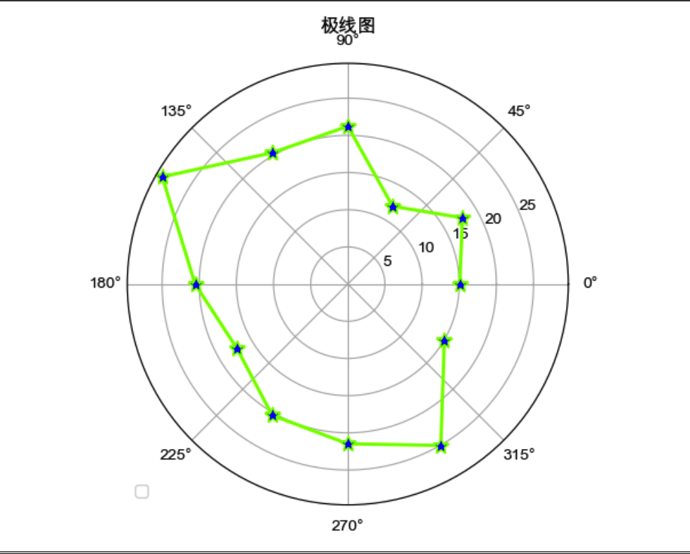
极线图
plt.polar(theta, r, color="chartreuse", linewidth=2, marker="*", mfc="b", ms=10)
import matplotlib as mpl
import matplotlib.pyplot as plt
import numpy as np

plt.rcParams['font.sans-serif'] = ['Arial Unicode MS']
mpl.rcParams["axes.unicode_minus"] = False

barSlice = 12
theta = np.linspace(0.0, 2*np.pi, barSlice, endpoint=False)
r = 30 * np.random.rand(barSlice)

plt.polar(theta, r, color="chartreuse", linewidth=2, marker="*", mfc="b", ms=10)

plt.title("极线图")

plt.legend(loc="lower left")
plt.show()
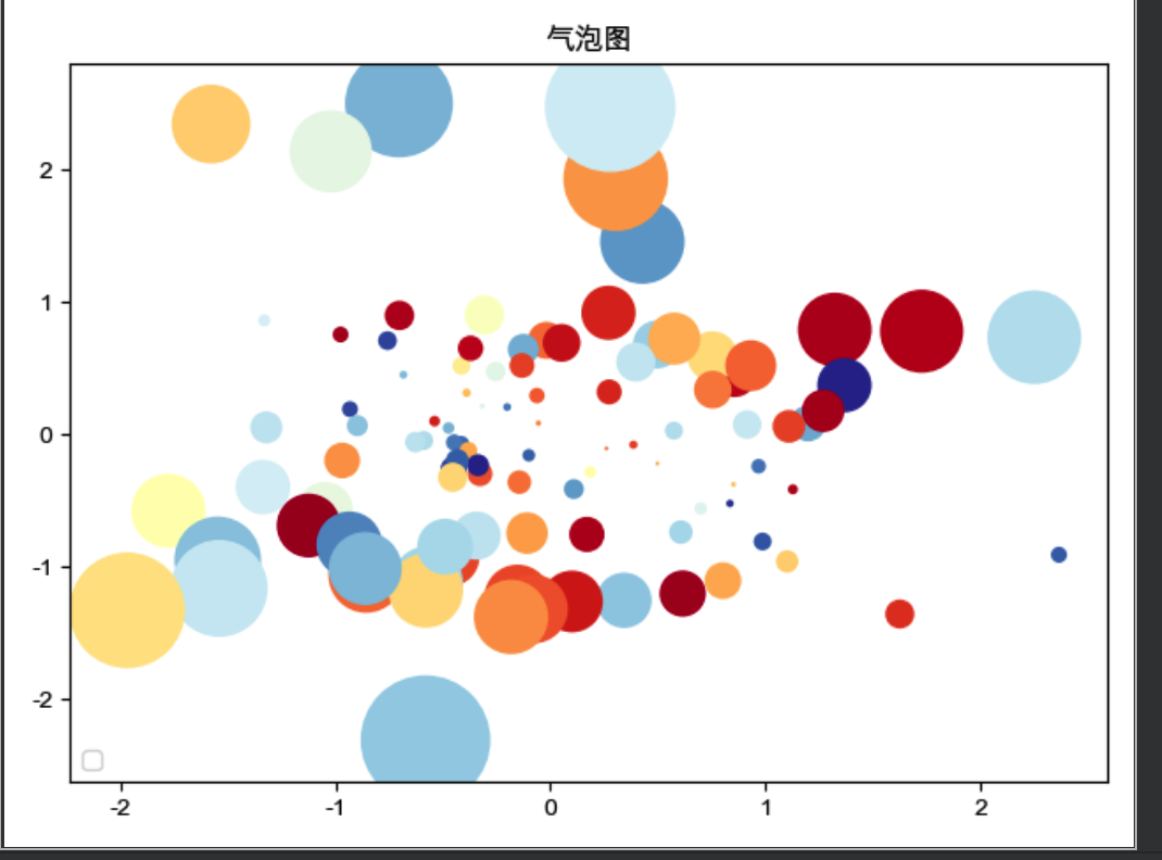
气泡图
import matplotlib as mpl
import matplotlib.pyplot as plt
import numpy as np

plt.rcParams['font.sans-serif'] = ['Arial Unicode MS']
mpl.rcParams["axes.unicode_minus"] = False

x = np.random.randn(100)
y = np.random.randn(100)

plt.scatter(x, y, s=np.power(10*x + 20*y, 2), c=np.random.rand(100), cmap=mpl.cm.RdYlBu, marker="o")

plt.title("气泡图")

plt.legend(loc="lower left")
plt.show()
s: 气泡大小c: 气泡颜色cmap: 将浮点数值映射成颜色的颜色映射表
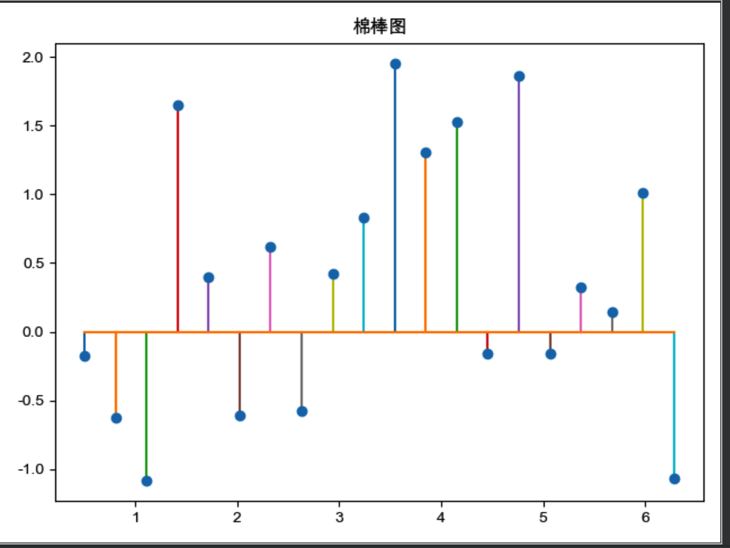
棉棒图
https://matplotlib.org/api/_as_gen/matplotlib.pyplot.stem.html
import matplotlib as mpl
import matplotlib.pyplot as plt
import numpy as np

plt.rcParams['font.sans-serif'] = ['Arial Unicode MS']
mpl.rcParams["axes.unicode_minus"] = False

x = np.linspace(0.5, 2*np.pi, 20)
y = np.random.randn(20)

plt.stem(x, y, linefmt="-", markerfmt="o", basefmt="-")

plt.title("棉棒图")

# plt.legend(loc="lower left")
plt.show()
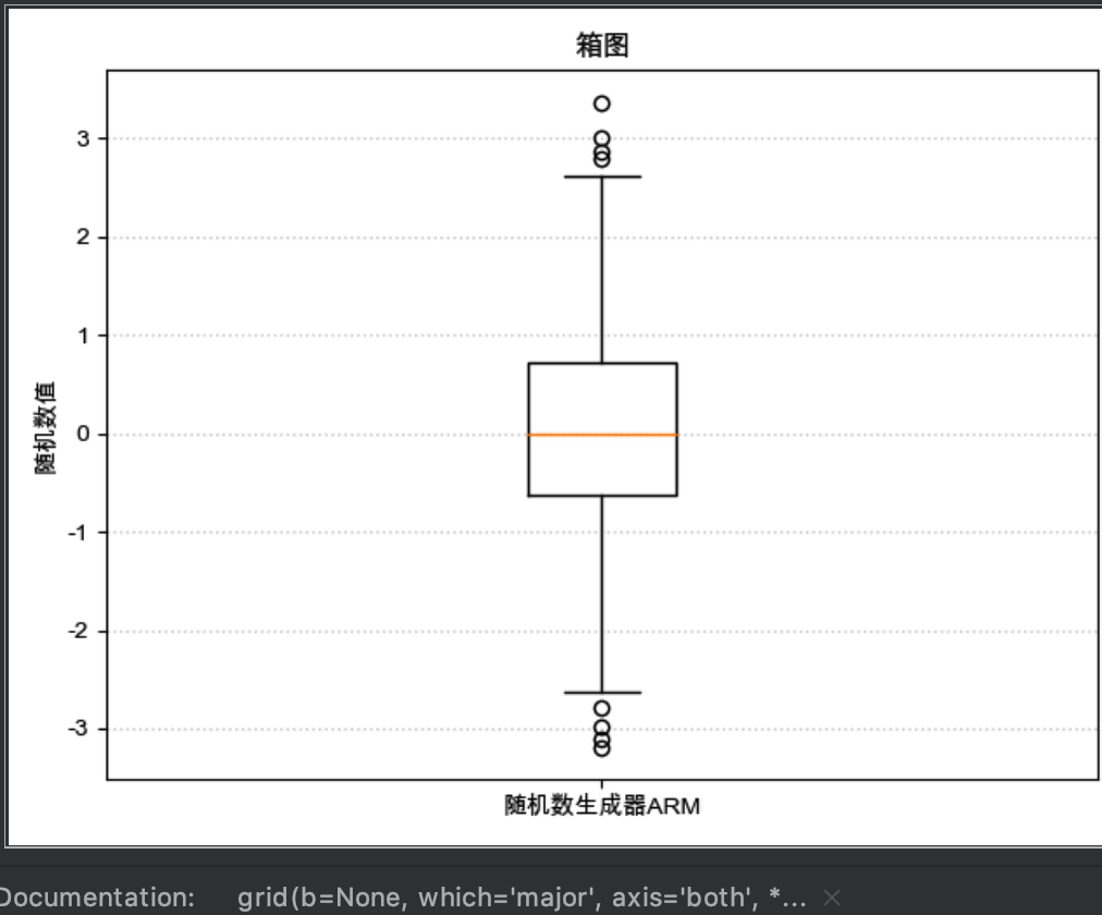
绘制箱线
import matplotlib as mpl
import matplotlib.pyplot as plt
import numpy as np

plt.rcParams['font.sans-serif'] = ['Arial Unicode MS']
mpl.rcParams["axes.unicode_minus"] = False

x = np.random.randn(1000)
plt.boxplot(x)
plt.xticks([1], ["随机数生成器ARM"])
plt.ylabel("随机数值")
plt.title("随机数生成器抗干扰能力稳定性")
plt.grid(axis="y", ls=":", lw=1, color="gray", alpha=0.4)


plt.title("箱图")

# plt.legend(loc="lower left")
plt.show()
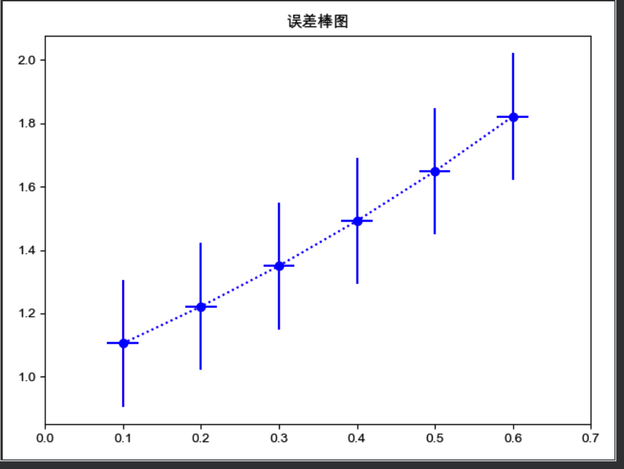
误差棒图
import matplotlib as mpl
import matplotlib.pyplot as plt
import numpy as np

plt.rcParams['font.sans-serif'] = ['Arial Unicode MS']
mpl.rcParams["axes.unicode_minus"] = False

x = np.linspace(0.1, 0.6, 6)
y = np.exp(x)
plt.errorbar(x, y, fmt="bo:", yerr=0.2, xerr=0.02)
plt.xlim(0, 0.7)
plt.title("误差棒图")

# plt.legend(loc="lower left")
plt.show()
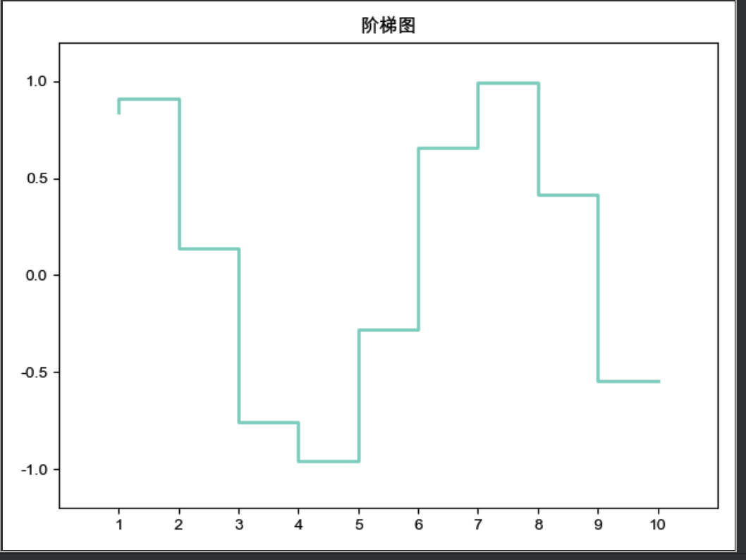
阶梯图
import matplotlib as mpl
import matplotlib.pyplot as plt
import numpy as np

plt.rcParams['font.sans-serif'] = ['Arial Unicode MS']
mpl.rcParams["axes.unicode_minus"] = False

x = np.linspace(1, 10, 10)
y = np.sin(x)
plt.step(x, y, color="#8dd3c7", where="pre", lw=2)
plt.xlim(0, 11)
plt.xticks(np.arange(1, 11, 1))
plt.ylim(-1.2, 1.2)

plt.title("阶梯图")

# plt.legend(loc="lower left")
plt.show()
完善图图形
图例
plt.legend(loc="upper left", bbox_to_anchor=(0.05, 0.95), ncol=3, title="title", shadow=True, fancybox=True)
loc: 位置参数bbox_to_anchor: 线框位置参数. 是一个四元元组- 第一个元素, 表示距离画布左侧 x 轴长度的倍数的距离
- 第二个元素, 表示距离画布底部 y 轴长度的倍数的距离
- 第三个元素, 表示x 轴长度的倍数的线框长度
- 第四个元素, 表示y 轴长度的倍数的线框宽度
title: 标签内容的标题shadow: 线框阴影fancybox: 圆角
画布标题
plt.title("这是标题", loc="right", family="字体 Family", size=20, style="oblique", color="c")
改变刻度标签
plt.xticks([数据...], [标签...])
x 轴逆序
plt.xlim(大, 小)
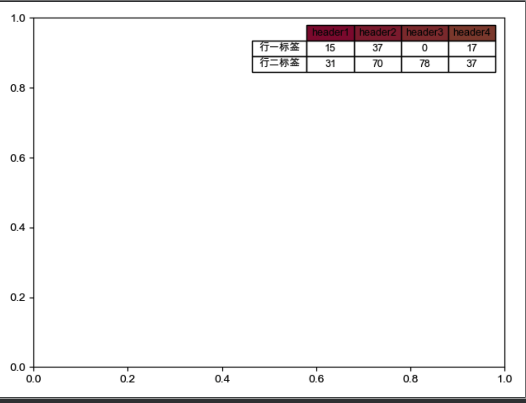
添加表格
import matplotlib as mpl
import matplotlib.pyplot as plt
import numpy as np

plt.rcParams['font.sans-serif'] = ['Arial Unicode MS']
mpl.rcParams["axes.unicode_minus"] = False

# np.random.randint(5, size=(2, 4))
data = np.random.randint(100, size=(2, 4))
print(len(data))
rowLabels = ["行一标签", "行二标签"]
print(len(rowLabels))

plt.table(cellText=data, cellLoc="center",colWidths=[0.1] * 4,
          colLabels=["header1", "header2", "header3", "header4"],
          colColours=["#8d1a3c", "#8d2a3c", "#8d3a3c", "#8d4a3c"],
          rowLabels=rowLabels,
          rowLoc="center",
          loc="best")

plt.show()
刻度自适应
plt.autoscale(enable=True, axis="both", tight=True)
tight: 让坐标轴的范围调整到数据的范围上
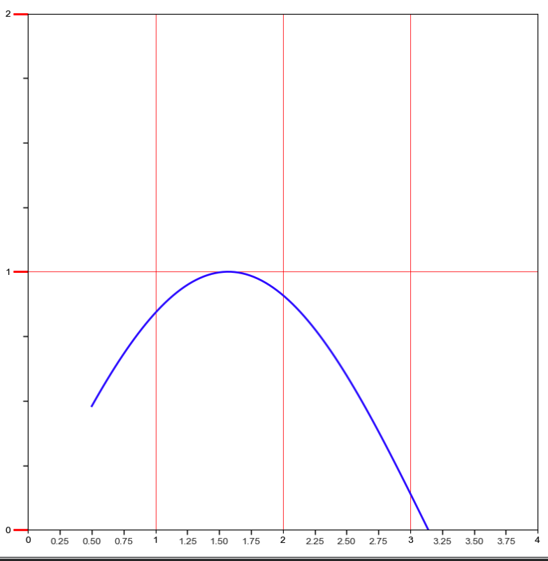
刻度定位器和格式器
import matplotlib as mpl
import matplotlib.pyplot as plt
import numpy as np
from matplotlib.ticker import AutoMinorLocator, MultipleLocator, FuncFormatter

plt.rcParams['font.sans-serif'] = ['Arial Unicode MS']
mpl.rcParams["axes.unicode_minus"] = False

x = np.linspace(0.5, 3.5, 100)
y = np.sin(x)

fig = plt.figure(figsize=(8, 8))

ax = fig.add_subplot(111)

# set major
ax.xaxis.set_major_locator(MultipleLocator(1.0))
ax.yaxis.set_major_locator(MultipleLocator(1.0))

# set minor
ax.xaxis.set_minor_locator(AutoMinorLocator(4))
ax.yaxis.set_minor_locator(AutoMinorLocator(4))


# set minor formatter

def minor_tic(x, pos):
    if not x % 1.0:
        return ""
    return "%.2f" % x


ax.xaxis.set_minor_formatter(FuncFormatter(minor_tic))

ax.tick_params("y", which="major", length=15, width=2.0, color="r")
ax.tick_params(which="minor", length=5, width=1.0, labelsize=10, labelcolor='0.25')

ax.set_xlim(0, 4)
ax.set_ylim(0, 2)

ax.plot(x, y, c=(0.25, 0.25, 1.00), lw=2, zorder=10)
ax.grid(linestyle="-", linewidth=0.5, color="r", zorder=0)


plt.show()
ax.xaxis.set_major_locator(MultipleLocator(1.0)): 表示在 x 轴的 1 倍处分别设置主刻度线.ax.xaxis.set_minor_locator(AutoMinorLocator(4)): 表示在 x 轴设置次要刻度线.AutoMinorLocator(4)表示将每一份主刻度线区间等分为 4 份ax.xaxis.set_minor_formatter(FuncFormatter(minor_tic)): 设置次要刻度线显示位置的精度ax.tick_params("y", which="major", length=15, width=2.0, colors="r"). 也可通过plt.tick_params()来设置- 设置主刻度的样式(which=“major”)
length: 表示主刻度线的长度width: 设置主刻度线的宽度colors: 设置主刻度线和主刻度标签的颜色
定制
import matplotlib as mpl
import matplotlib.pyplot as plt
import numpy as np
from matplotlib.ticker import AutoMinorLocator, MultipleLocator, FuncFormatter

plt.rcParams['font.sans-serif'] = ['Arial Unicode MS']
mpl.rcParams["axes.unicode_minus"] = False

fig = plt.figure(facecolor=(1.0, 1.0, 0.9412))
ax = fig.add_axes([0.1, 0.4, 0.5, 0.5])

for ticklabel in ax.xaxis.get_ticklabels():
    ticklabel.set_color("slateblue")
    ticklabel.set_fontsize(18)
    ticklabel.set_rotation(30)

for tickline in ax.yaxis.get_ticklines():
    tickline.set_color("lightgreen")
    tickline.set_markersize(20)
    tickline.set_markeredgewidth(2)

plt.show()
定制 Y 轴的标签
from matplotlib.ticker import FormatStrFormatter

ax.yaxis.set_major_formatter(FormatStrFormatter(r"$\yen%1.1f$"))
水印文本
plt.text(1, 2, "文本", fontsize=50, color="gray", alpha=0.5)
划分画布
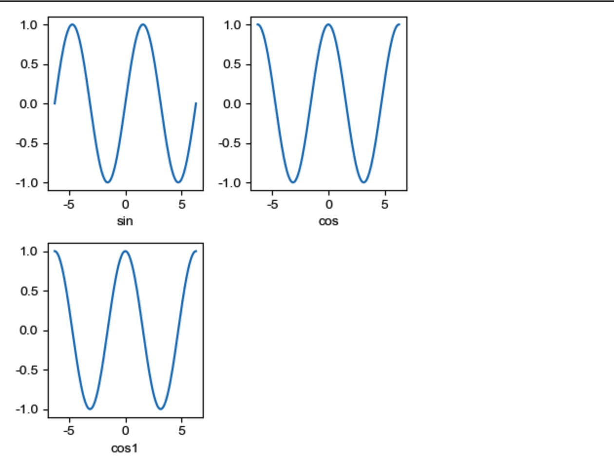
subplot
subplot(rows, cols, plotNum) 或 subplot(RCN)
子区编号从 1 开始,左上角是第 1, 序号依次向右递增. 也就是说, 每行的子区位置都是从左向右进行升序. 即 subplot(2, 3, 4) 是第二行的第四个子区.
import matplotlib as mpl
import matplotlib.pyplot as plt
import numpy as np
from matplotlib.ticker import AutoMinorLocator, MultipleLocator, FuncFormatter

plt.rcParams['font.sans-serif'] = ['Arial Unicode MS']
mpl.rcParams["axes.unicode_minus"] = False

x = np.linspace(-2 * np.pi, 2 * np.pi, 200)
y = np.sin(x)
y1 = np.cos(x)

plt.subplot(231)
plt.xlabel("sin")
plt.plot(x, y)

plt.subplot(232)
plt.xlabel("cos")
plt.plot(x, y1)

plt.subplot(234)
plt.xlabel("cos1")
plt.plot(x, y1)

plt.show()
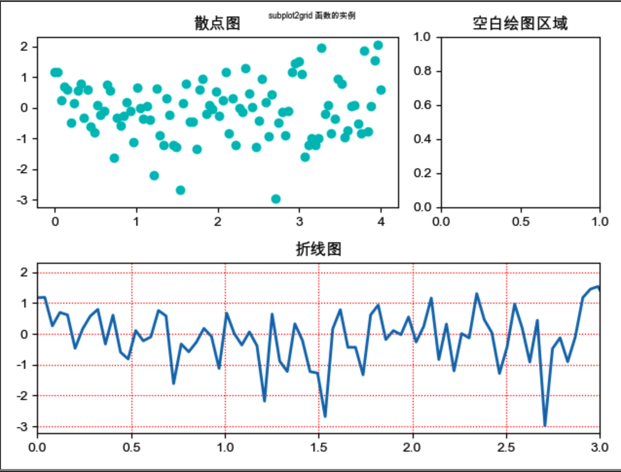
subplot2grid
让子区跨越固定的网格布局
subplot 只能绘制等分画布. 但 subplot2grid 可使用 rowspan 和 colspan 参数让子区跨越固定的风格的多个行和列.
subplot2grid((rows,cols), (第几行,第几列), colspan=跨多少列, rowspan=跨多少行)- 第一行, 第列表示
(0, 0) 注意, 行列, 是
从 0 开始算起import matplotlib as mpl import matplotlib.pyplot as plt import numpy as np from matplotlib.ticker import AutoMinorLocator, MultipleLocator, FuncFormatter plt.rcParams['font.sans-serif'] = ['Arial Unicode MS'] mpl.rcParams["axes.unicode_minus"] = False plt.subplot2grid((2, 3), (0, 0), colspan=2) x = np.linspace(0.0, 4.0, 100) y = np.random.randn(100) plt.scatter(x, y, c="c") plt.title("散点图") plt.subplot2grid((2, 3), (0, 2)) plt.title("空白绘图区域") plt.subplot2grid((2, 3), (1, 0), colspan=3) x = np.linspace(0.0, 4.0, 100) y1 = np.sin(x) plt.plot(x, y, lw=2, ls="-") plt.xlim(0, 3) plt.grid(True, ls=":", c="r") plt.title("折线图") plt.suptitle("subplot2grid 函数的实例", fontsize=6) plt.show()
subplots
fig, ax = plt.subplots(rows, cols)
返回多个子区. 然后可用过 ax[N] 来引用不同子区, 然后设置相应的图形参数即可. 比如
ax1=ax[0]
ax1.plot(x, y)

ax2=ax[1]
ax2.plot(x,y)
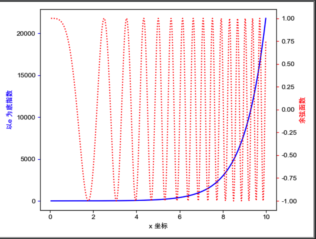
共享坐标轴
共享 X 轴: axes2 = axes.twinx()
共享 Y 轴: axes2 = axes.twiny()
import matplotlib as mpl
import matplotlib.pyplot as plt
import numpy as np
from matplotlib.ticker import AutoMinorLocator, MultipleLocator, FuncFormatter

plt.rcParams['font.sans-serif'] = ['Arial Unicode MS']
mpl.rcParams["axes.unicode_minus"] = False

fig, ax1 = plt.subplots()
t = np.arange(0.05, 10.0, 0.01)
s1 = np.exp(t)

ax1.plot(t, s1, c="b", ls="-")
ax1.set_xlabel("x 坐标")
ax1.set_ylabel("以e 为底指数", color="b")
ax1.tick_params("y", color="b")

ax2 = ax1.twinx()
s2 = np.cos(t**2)
ax2.plot(t, s2, c="r", ls=":")
ax2.set_ylabel("余弦函数", color="r")
ax2.tick_params("y", color="r")

plt.show()
在画布中任意位置添加坐标轴
plt.axes([left, bottom, width, height], frameon=True, axisbg="y")
left: 表示左侧边缘距离画布的距离bottom: 表示底部边缘距离画布的距离
保存图片到文件
plt.savefig("/tmp/hello.png")
Mac 里显示中文
import matplotlib as mpl
import matplotlib.pyplot as plt
import numpy as np

plt.rcParams['font.sans-serif'] = ['Arial Unicode MS']
mpl.rcParams["axes.unicode_minus"] = False
风格
| Character | Line Style |
|---|---|
'-' |
solid line |
'--' |
dashed line |
'-.' |
dash-dot line |
':' |
dotted line |
TeX 功能
通过 r"$...$" 来渲染